
Your brand colours have a strong emotional impact, but how do they appear to site visitors who are partially sighted, colorblind, or face environmental factors that make visibility difficult?
Color and contrast levels are critical to communication, and getting these details just right is critical for the accessibility-minded designer.’
Color perception disorders are more common than you might think. So, in this post, we’ll talk about how people with disabilities like low vision, dyslexia, and colour blindness interact with the web.
Table of Contents
How do I use a colour checker to improve the accessibility of my website?
This section is actually quite simple, though it does require some effort. You will need to utilise WebAIM’s online Contrast Checker tool. WebAIM is a non-profit organisation based at Utah State University with the mission of enhancing web accessibility worldwide.
Simply enter your foreground colour (e.g., the colour of your text or icons) and background colour as hexadecimal values (also known as hex values), as specified in HTML or CSS, and the contrast ratio checker will inform you if the ratio is sufficient. Remember that the minimum contrast ratio you should seek is 4.5 to 1. Black text on a white background has a contrast ratio of 21 to 1, so you have a great deal of leeway.
5 Tools for Making a Web Color Palette That Everyone Can See
1. WebAIM Color Contrast Checker
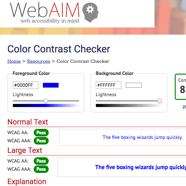
Enter the hex colours for the foreground and background. The output shows AA and AAA compliance for normal and large text, along with a sample sentence. Sliders let you change things until you find a good combination.
Strengths
- Simple tool with an interface that’s easy on the eyes.
- This is a nice, simple tool for beginners, and not just designers.
Weaknesses
- Can’t compare more than two colours, only two.
- The lightness slider isn’t a very good way to choose colours. It’s hard to tell how attractive colours are in this simple display.
2. Contrast Checker for WCAG
Enter the hex colours for the foreground and background. Shows AA and AAA compliance for normal and large text next to a sample of Lorem Ipsum text. You could also upload a picture. A 9-color palette is chosen for you automatically. Then, you can compare each colour as either the Foreground or the Background colour.
Strengths
- Simple tool with a user-friendly interface.
- Having the ability to make palettes from images.
Weaknesses
- The palette is chosen automatically, and you can change it further with the colour picker, but those changes don’t get saved back to the palette. One must copy and paste the information into a new document.
3. Color Cube
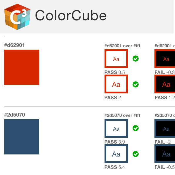
Enter the colours for the palette, each on its own line. The output shows sample letters with contrast ratios compared to AA standards for small and large fonts. Three columns show contrast with a white background, a black background, and a set of brand colours that are the “Most legible from available.”
Strengths
- Easy-on-the-eyes The user interface (UI) is well-organized, and the pass/fail/edge status is easy to see.
Weaknesses
- Does not meet the standards set by AAA.
- Doesn’t do every possible colour combination, and it’s not clear at first that this is the case.
4.) Eight Shapes Contrast Grid
Enter palette colours. Also, you can give each colour a name. The app makes a table with every possible combination of colours. There are three sizes of tiles. There are visual cues for AA and AAA pass/fail/edge and effective contrast ratio. Columns and rows can be moved around in the app by dragging and dropping. Tabular data can be saved, exported, and shared.
Strengths
- There are a lot of helpful features that help with the analysis of whole palettes.
Weaknesses
- It’s harder to learn than other tools that are easier to use.
- Not the right way to compare only two colours.
- Not good for figuring out how colours go together.
- A bit overwhelming to look at, but there is a lot of information being shown.
5. Color safe
Type in the background colour. Choose the family, size, and weight of the font. Pick AA or AAA as the standard. Shows the selected colour and its hex code, as well as a sample and the effective contrast ratio. The large thumbnails of possible foreground colours with enough contrast are the best part. You can choose to look at all of them or just certain colour groups (greens, blues, purples, etc.)
Strengths
- With an interface that’s easy on the eyes, it’s easy to find a combination of colours that looks good and works well.
- This is a useful tool if you don’t already have a brand colour palette or if you want to add to one that you already have for the web.
Weaknesses
- You can only compare foreground and background colours at a time.
- You have to copy and paste colours into a separate document if you want to save them.
- Go out and make things for everyone!
Once you know how to use these tools, you may find that you need more than one for a project. Maybe Color Cube is the best way to show a client what you’ve learned about accessibility. Maybe you’ll use WebAIM’s tool all the time to do quick spot checks.
Conclusion
Using the tips, guidelines, and tools we just talked about, you can give your website high-contrast colours and labels. This will make it easier for people with low vision, dyslexia, and colour blindness to read your website and content. Don’t be surprised if your general audience also finds it easier to use your website.