What to know about Elementor Sticky Header? This article is for you.
If you are looking for software to satisfy all of your webpage designing needs, Elementor is the best one out there. It provides you with the necessary resources required to quench your need for web designing.
Curious to know more about Elementor, then check out our detailed Elementor Review.
A sticky header is a type of design that sticks the top menu bar or the navigation bar at the top of your browser window, even when scrolling. This can be useful if you have a long page and would like your site visitors to see it without having to scroll down.
It’s easy! Keep reading for more information on how to add this element to your website using Elementor.
About Elementor Sticky Header
After this brief introduction to Elementor, let me just shift your attention to its use on the header part of the web-page, so as you can get to know in detail the depths of this software.
This article is just going to focus on Elementor Sticky Header . Why do you ask? Just to show you what all can be done to make the header of your page look pretty good. The first thing that you see when you open a web-page is its header component.
As attractive as it should be, it should also contain all navigational elements about the page, to get easier access to them.
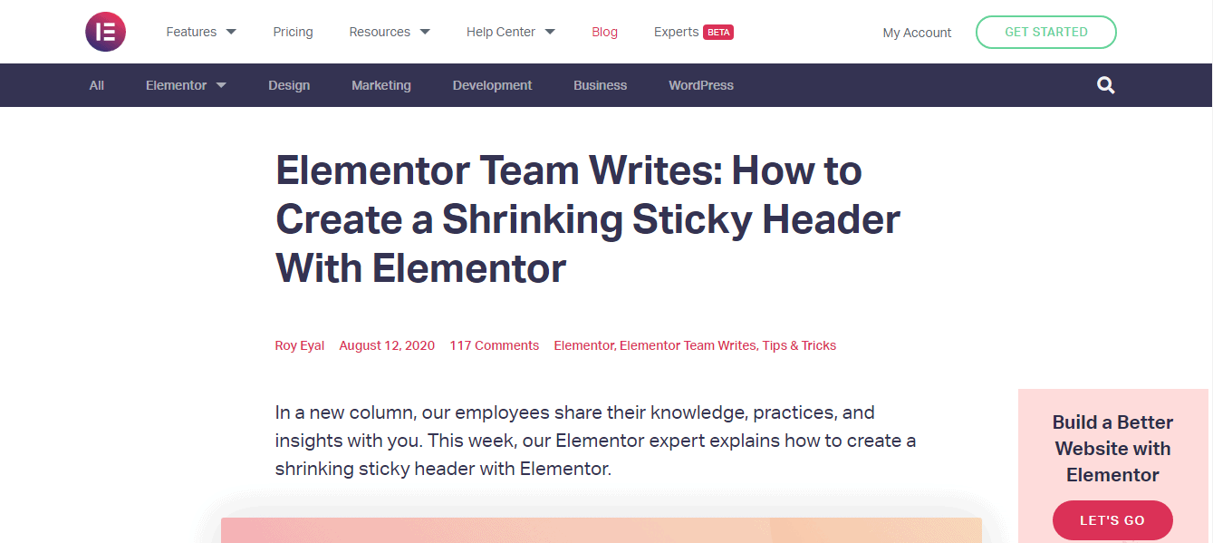
Elementor not only provides you with an appealing header design, but it also looks after the aspects of placing the elements in an appropriate fashion, with proper spacing and all the required information to get you through the page effortlessly.
Further, reading this article, you will get to know what exactly can be done in a header, so as to try and make the best of Elementor in one part of the page.
What is an Elementor Sticky Header?
Now, what do I mean by sticky headers? Sticky headers are those which have their positions fixed at all the times a viewer scrolls through the page. In simple words, you scroll and the header follows!
Elementor provides a variety of options in designs, themes, add-ons, transitions, animations to create your header, fully considering your visions.
You get thousands of font styles and colors to choose from.
Now, to make your header a sticky one, you can get the option in the motion effects tab of the header section.
Elementor makes sure that the web-page designs are accessible in all types of devices so no matter what, the same design effects get applied, whether you use a mobile, tablet, laptop, or computer.
Now, if you get confused about what type of styles, effects, fonts to choose from, Elementor also provides design templates to make your work much, much easier.
Where is the element of the sticky header used?
Sticky navigation or sticky headers are generally used in e-commerce, retailing, and other types of websites which include selling and buying products. In these cases, sticky headers have been of great significance to improve customer’s experience of reviewing products.
It is also used by people who have large content on their websites such as article writers, journalists to help the user.
Why do we use sticky headers?
Sticky headers are a frequently used pattern in front end development. It allows the user to access the page’s headers and menu section even after a lot of scrolling. Sticky headers play a major role in pages with a lot of content to make them user-friendly and intuitive.
Sticky headers achieve the job of “back to top” links which were used in the past. It helps improve the digital experience of the user.
Visitors sometimes feel lost navigating through long pages and contents to find the topics that they need or prove useful to them, this makes them stressed and annoyed, causing them to leave the particular site. This is exactly why sticky headers are used.
Now, if you are going to implement sticky headers, make sure you ensure the following things for the best results of your webpage. Think of them as your golden rules.
- Avoid iframes. When you need your site to look good and work well in multiple browsers, then it’s best to avoid iframes, as they are your enemies in this case. They do not provide security and have SEO issues. So don’t use them.
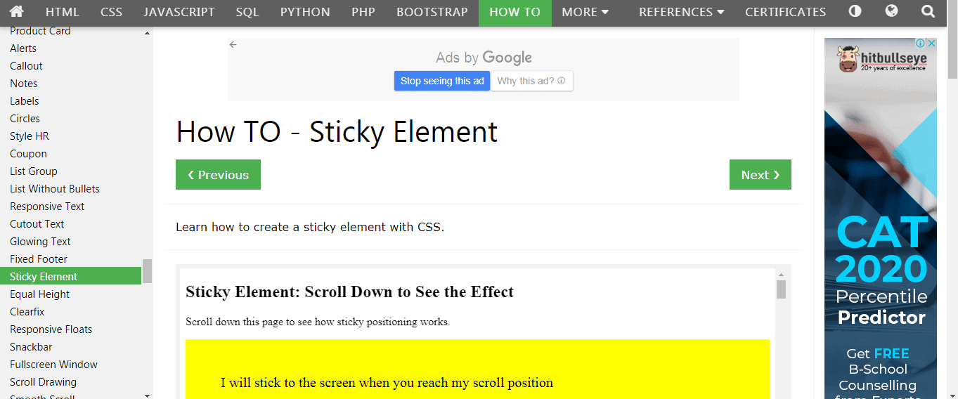
- Say ‘yes’ to CSS. Simplicity and speed are two things everyone loves. To code, sticky navigation is not so easy but is not impossible. Use CSS to get things done in a quick and easy manner. Don’t forget to pay attention to position, margin-top, and z index.
- Half hide your search. Permanent menus can sometimes be distracting to the users especially when it is very long, so instead, try hiding the search input in favor of just the magnifying glass icon.
- Collapsing menus. Some of the users know their way around the site and do not need sticky navigation. You could make your menus collapsible, just to help them in case they do require the menu at some point. No solution works for every case so be flexible.
How To Create Sticky Headers Using Elementor?
Sticky headers can be created using 5 simple steps.
Step 1– Creating a theme builder template area.
- Go over to templates
- Find the theme builder and then click on headers.
- Locate the button that says: Add new button. This can be found on the top left. Again, you can choose the header.
- At this point, you will be given an option to name the template. Do so carefully so that you will have it available for future reference.
Step 2– Creating Transparent headers
Elementor section backgrounds automatically tend to be transparent, but the header is not. To make the header transparent-
- Go to the sections tab
- Click on the style button, under which click on the background tab.
- Click the paint icon and toggle the capacity.
We need to make the HTML tag a header tag, so the following steps can be followed-
- Locate the section handle, then you can open settings and click on the layout tab.
- Re-select and make the Header as HTML
If you are using Elementor pro to add an HTML tag as the header, go to settings. Then find the option that says general settings, Once you go there you will see an option that says HTML tag, so you can apply it to the header.
Step 3- Changing the background color of the header
- Location the button named as section handle and find your way over to the advanced settings
- Click on motion effects
- Select sticky-set and send to top
- Click on Custom CSS and choose the background color you wish to choose
Step 4- Drag & Drop site Logo & Nav Menu
This step is to create a Navigation menu into your page structure
- Click on Drag and Drop- the “site Logo” and the Nav Menu.
- Click on site Logo, (this is a widget) to open the logo settings and go to the advanced tab>
- When you see the Advanced tab options, give a name under CSS classes.
- Also, add CSS classes to Nav Widget under the Advanced Tab.
Step 5- Shrink your Logo & Your Navigation Menu with Elementor via CSS
Select the Logo Widget, Under the ‘Advanced’ tab select custom CSS and type the CSS code. Follow the same steps to shrink the Navigation Menu Widget.
This enables a change in the width of the logo from 60% to 55%.
These are the steps to create sticky headings.
To disable the sticky header, log into Word press and go to Appearance, click on customize, and then on general theme settings. Under this option, select the header and uncheck the box beside the sticky header to disable sticky headings. Easy right?
Features of Sticky headers in Elementor
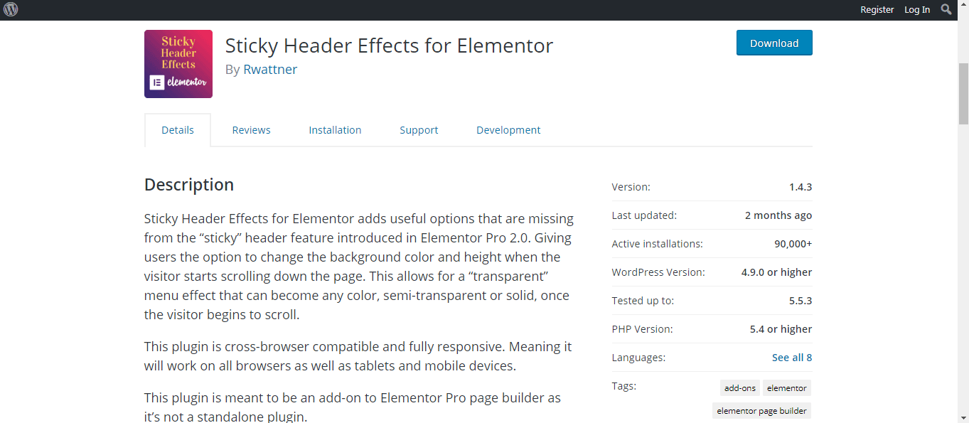
Sticky header Effects for Elementor allows options to change the background color, the height of the header, make the heading transparent, and many other effects.
A few of the features of Elementor are-
- Options panel built-in to Elementor Pro’s advanced sections options to clear up workspace
- Application of options- A scroll always grabs the reader’s attention rather than text fixed on the web page, hence this option helps you to add the scrolling effects for best results.
- Header background-color- The background color is always the first thing your eyes check out naturally, hence it is important to choose an attractive and beautiful background color. This tool helps you choose and apply the background color of your own choice, along with color name support.
- Bottom Border- This tool lets the user alter the bottom border’s complexion and consistency.
- Shrink Header- An effect that helps in minimizing the length to increase the space without losing content or functionality.
- Shrink Logo- Helps in changing the height of the logo.
Pro Features that are coming up soon-
- Replace the logo- Helps in changing the image of the logo.
- Opening animations- there are two options to slide inside and fade inside in the Available animations along with the durations.
- Hide elements- This helps the user to repress or reveal header elements after scrolling.
- Box shadow- Addition or Removal of the box-shadow effect
- Menu toggle animations- Entering and exiting of them.
Pricing
Elementor provides most of its components without a charge, which includes editing techniques that make it easier to create elements, more than 40 widgets, and around 30 templates to choose from. There are no limits in the number of sites it can be used on.
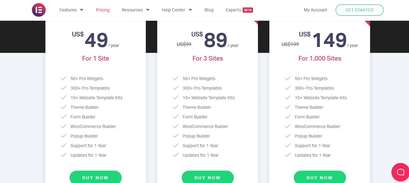
Now, for an extra set of features and the number of sites it can be used on, Elementor provides 3 types of subscription plans.
- Elementor Personal: This comprises all the features included in free, with addition to theme builders, pop-up builders, more than 50 widgets, around 300+ templates, 10+ website template kits, supports, and updates for a year, only for $49/year. This plan is only available for 1 site.
- Elementor Plus: This comprises all the features included in free, with addition to theme builders, pop-up builders, more than 50 widgets, around 300+ templates, 10+ website template kits, supports, and updates for a year, only for the price of $99/year. This plan is only available for 3 sites.
- Elementor Expert: This comprises all the features included in free, with addition to theme builders, pop-up builders, more than 50 widgets, around 300+ templates, 10+ website template kits, supports, and updates for a year, only for the price of $199/year.
- This plan is only available for 1000 sites. This is the most popular choice among many professionals because it’s cheaper compared to the rest of them and also on the account of the number of sites they can be used on.
Pros and Cons
User Review

Quick Links:
- Elementor Pro Tutorial: Learn Something Important
- BEST ELEMENTOR ADD ONS: Use Via Elementor
- How to Setup a CPA Landing Page With Elementor?
FAQs on Elementor Sticky Header
☞What is the difference between Elementor and Elementor pro?
The difference between these two can be analyzed under four different criteria as written by Theme builder- It has no restrictions on these boundaries. The users have the feature to design their footers, and even the header, they can furthermore archive all the pages in an easy manner as it functions on any theme which is based on WordPress and does not require coding whereas Elementor theme building does require coding. Contact forms- Elementor proper’s forms widget is known to be extreme since the entire process of managing the forms is visual, unlike elementor. This proves to be of great advantage as designing your forms can be done within some touches on the screen. Templates and blocks- The available templates and blocks on Elementor pro are professionally prepared if we compare them to the basic version of the elementor. The templates in elementor pro can also be customized with the addition of various animations, pages emphasizing the slides. Key professional widgets- It consists of some significant widgets that are valuable for professional web designers, unlike elementor. This includes Animated headline, custom fonts, media carousel, etc. Apart from the above features, there are other things which are included in elementor pro but not in elementor such as- popup builder, scrolling effects, nav menu, login widget, header, and footer builder, archive page design, blog pagination, etc.
🤷♀️What is sticky scrolling?
Sticky scrolling is a cool way to grab the reader’s attention with the help of animation where various elements first stick to the forefront of the webpage or a document and then slowly start to disappear. To upload a sticky scrolling all you need to do is to click on a new page, then on the themify custom panel, select the desired outcome, turn on the builder, load a layout and add sticky effects for the text you wish to. You can also add various effects such as background color, transition effects, and animations.
👍Which theme works best with Elementor?
Elementor works well with all themes which respect the coding standard of word press but those which work the best are Hello, Layers, BuWoo, Sydney, OceanWp, etc. Premium themes that work best are- Bellevue, Hestia pro, Gumbo, Sonaar, Schema, Jupiter X, Rhodos, etc.
🙌Pricing: How Much Does Elementor Cost?
$ 49 per year is an attractive amount to pay to upgrade to Elementor's pro edition. It costs just $ 99 for a three-site license and $ 199 for a 1,000-site license. All WordPress users may install the free version of Elementor to get acquainted with the plugin's capabilities and limitations.
👉Do you need Elementor Pro?
Totally depends on your requirements. However, we do highly recommend it.
⁉️Who Is Elementor Best Suited To?
Elementor is a WordPress page builder that utilizes drag-and-drop functionality. This plugin enables you to build visually appealing pages via the use of a visual editor. It's intended to let you rapidly create dynamic websites. This WordPress plugin is a one-stop shop, allowing you to manage all aspects of your website's design from a single platform. So, it is important for anyone with a website.
📋Is Elementor Right For You / What do I need to use Elementor?
Yes, it definitely is. Elementor is the greatest, simplest, all-in-one solution for anybody who wants to create websites fast and easily without having to modify any code. It is the most popular page builder for WordPress, owing to its simple 'drag and drops' interface.
☝️Can I use Elementor with any theme?
Yes, you can. With the introduction of Elementor Theme Builder, you can create the header, footer, single posts, and archive page for any theme. If you're a developer or marketer searching for the quickest theme, download Hello Elementor, our totally free barebones theme.
📎Do I need to know HTML/CSS to use Elementor?
No, you don’t. that is the best part of Elementor.
Conclusion: Elementor Sticky Header 2025
Did this article help you with what you were looking for? I hope it did. You get the main elements of Elementor free of cost and you get to try it on any number of sites.
It has many templates to choose from, each different and more stunning than the other. Web-pages are the main element of many businesses. Web designing makes it accessible and presentable to the viewers.
Headers are the first thing that pops up when you open a page. So, it is absolutely necessary to make it look attractive and eye-catching and help the businesses captivate the audiences.
Whether you need something simple or complex, from bold colors to elegant typography, the Elementor sticky header will help make your webpage stand out among the competition.
It is the best out there!
Elementor Popular Videos
Elementor On Social Media
Page Builder Summit 2021 (@summit_camp) is starting tomorrow! Get your FREE ticket and talk to over a 35 industry experts including @bpines1 . Excited to be sponsoring this great event. See you there! 💻🎉https://t.co/gDtFpUJLBH
— Elementor (@elemntor) May 9, 2021
Step aside and welcome our April 2021 Showcase. 🏆🌷 This month we applaud 10 design agencies from all around the globe. This diverse collection accounts for the Elementor web creation talent around the world. 🌎 https://t.co/bwwOUDQCuu
— Elementor (@elemntor) May 19, 2021

