It’s hard to run a WordPress blog. It takes a lot of creativity and hard work to get people to read your blog these days, and you might still fail to improve the user experience on WordPress Blog.
So How to Improve User Experience on WordPress Blog To Increase Traffic?
And the competition is getting fiercer every day. You need to do something different. You don’t have to learn how to code right away.
Elementor, which was just named the best WordPress plugin by torquemag.io, lets you make high-quality websites that look like they were made by professionals from your own home.
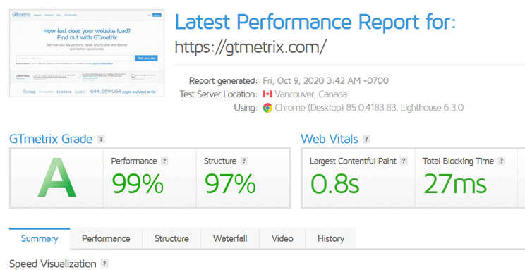
Check the Load Time of Your Website – GTmetrix

Fast loading is essential for one reason: humans have a very short attention span. It was previously in the double digits, but has now dropped to a single digit.
Let’s kill the suspense: recent studies show that the average human attention span is now 7 seconds. Users can easily switch to another Website because there are thousands of them offering the same service.
This means you have only 7 seconds to make an impression. In this limited time, you must persuade your readers to stay on your Website.
Fix Website Navigation
Regardless of the device being used to access your website, the navigation menu is crucial. An elevator is like navigation. Once clicked, each button directs website visitors to a specific page.
For instance, the header menu on our website has seven tabs. Where necessary, each Tab is further divided into Sub-Menus. The goal of this menu is to make it simple for visitors to navigate between other Web pages regardless of where they first land on the site.
Your website visitors will feel lost once they arrive if you don’t have a nice menu on it. They might even believe that since there isn’t a menu, there isn’t much information on your website.
AMP and WordPress
AMP is an abbreviation for Accelerated Mobile Pages. This technology provides a lightweight Smartphone experience by displaying Web-pages on mobile screens almost instantly. Facebook and Twitter have both used the AMP framework to make their sites load faster on mobile devices. Furthermore, Google recently announced the addition of AMP Technology to Web-Standards.
Fortunately, there are numerous WordPress plugins available to assist you in making your website AMP compatible.
Fear of Missing Out
Fear of Missing Out (FOMO) is a simple idea that says showing people what other people are doing on a website makes it more likely that they will do the same thing.
For example, you can get people to read a certain blog by putting up a “Fear of Missing Out” message that tells them which blog is the most popular on your site. You can also show a “Fear of Missing Out” pop-up with a blog’s comments.
Dual Color Headline
How do you capture your visitor’s attention at first glance? You make the headlines interesting and colourful. According to various reports, readers are drawn to the title and featured image first.
Following that, they decide whether or not to read the rest of the blog. So, when brainstorming titles for your next blog, don’t hold back your creative instincts.
Conclusion
Now that this blog post has come to an end, you should have enough information to begin using it if you have been reading it carefully.
We advise you to begin by making your site’s load time faster, then move on to making it responsive for mobile devices, adorning it with a simple navigation menu, FOMO messages, and dual colour headlines as a final step.


