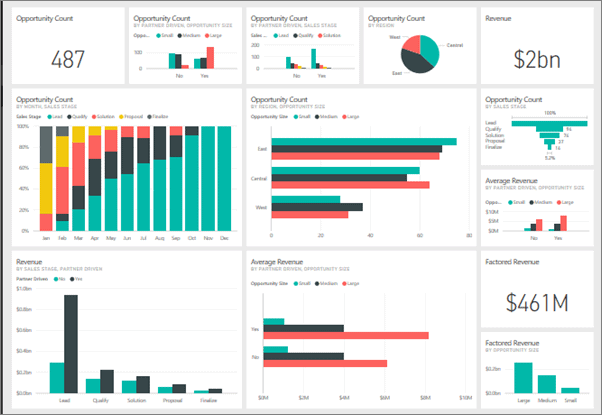
In this article, we have featured The Secrets To Successful Power BI Dashboards. A new Microsoft Power BI dashboard for the Human Resources department has been requested by our manager, who has approached you and asked you to develop it utilizing numerous data sources.
That is, how exactly do you go about building such a thing? Here, I’ll outline the important actions and procedures you must follow in order to construct an effective dashboard.
Using Power BI is the second step, but it isn’t the first one. With a sheet of A4 paper and a pencil, the best approach to visualize your Power BI dashboard is to do so.
A dashboard mock-up is the greatest approach to think through the questions before you begin working on the program. It also facilitates dashboard visualizations.
Power BI Dashboard Success Secrets: Key Metrics

Power BI relies on these measurements and KPIs to provide a solid foundation for its analysis. Key Metrics/Key Performance Indicators, For example, it may be the overall training cost, the number of persons trained, the average training cost per course, or the number of training courses that were done. A card, a gauge, and a KPI are the most typical ways to display critical metrics.
The study of trends is figuring out how a body of data evolves over time. Your dashboards and reports should show how the total training costs have changed over time. Line and area graphs are the most frequent trend visualizations.
Comparisons: Comparing distinct pieces of data and figuring out how big or tiny the results are, as well as the difference in magnitude, are what comparisons are all about.
Dashboards in Power BI may be used to compare the total training costs of different departments. Comparative data can be represented graphically in the form of bar and column graphs.
In order to grasp the entire contribution to a total figure, it is helpful to look at percentage contributions. A good illustration of this would be to look at the percentage of persons trained by gender. When presenting percentages, a pie graph is a suitable choice.
Creating a mock-up of your product
We have a concept of the many analyses and data you may present in the dashboard, so now is the time to start developing the mock-up. Begin by laying out your A4 paper in landscape orientation.
The most significant part of the dashboard in the upper left-hand side because this is where most users will begin looking when they first open it.
Starting with the most critical KPIs is a good place to begin. Display the many computations you want to show using card representations on paper.
In our scenario, we will present the total training cost, the number of people trained, the average training cost per course, and the total number of training courses.
Creating a dashboard layout
Move on to the dashboard formatting after everything is operating smoothly. There are a few basic rules of formatting and color usage that we’ll cover.
It’s usually easiest to read black writing on a white backdrop, in terms of readability. Consider mild grays, blues, or browns as contrast colors if you want to utilize something different.
What if someone wants to print the dashboard or put it on a projector? If you decide to use a black backdrop, think about what would happen. Avoid using strong colors unless you intend to attract attention to a specific area of the diagram.


